10 things I have learnt

by | | 1 comments

TASK 8.1 - GREEN IS GOOD!

by | | 0 comments


Being green is defiantly the way forward. It makes complete sense to me that if we don't stop using up all the planets resources and lower our carbon footprint, that one day, we will no longer be able to recognise it as the planet it is today.

Although this is quite a radical thought from someone who started recycling only a year ago(!) I admit, I didn't really care, and kind of took the opinion of "well it´s too cold in England anyway, lets warm up the earth a bit". I feel quite ashamed now. Although it is only over the past few years that I have been bombarded with news bulletins and advertising highlighting these environmental issues. I want to do something about it.

Maybe the best place to start is in the house. Well, with A house.


Add Image

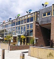
BedZED

Beddington Zero Energy Development is the UK’s largest mixed use sustainable community. It was designed to create a thriving community in which ordinary people could enjoy a high quality of life, while living within their fair share of the Earth’s resources.

People move to BedZED with typical lifestyles, and over the years change their behaviour significantly. The holistic design works on three levels:

1.the design solves problems such as heating and water usage

2. the design and services offered help people make sustainable choices such as walking rather than driving

3. the community have created their own facilities and groups to improve quality of life and reduce their environmental impact.

Designed and built by Bill Dunster architects ZEDfactory, it is a mixture of tenure homes and workspaces. This scheme features the first large scale use of zero carbon thermal mass buildings as well as other Eco friendly schemes that sound very complicated!

One thing that interested me was that they all moved in people me a year ago, not particularly knowledgeable about recycling or being environmentally friendly. Where as now the key facts are:

Energy: 81% reduction in energy use for heating, 45% reduction in electricity use (compared to local av.).

Transport: 64% reduction in car mileage 2,318km/year (compared to national av.).

Water: 58% reduction in water use 72 litres/person/day (compared to local av.).

Waste: 60% waste recycled.

Food: 86% of residents buy organic food.

Community: residents know 20 neighbours by name on average

One resident said this about the community:

“We wake up every morning and think we’re on holiday. The heat pours through the windows into the light, airy rooms. We have the sitting room upstairs to make access to the garden across the bridge easy. It’s very flexible”

Now this may seem a bit like an advert, but it is still inspiring, and if there was hope for them, then there is hope for me yet.

TASK 7 - Advertising ethics

by | | 0 comments

Good ethics and decency is something left behind in many advertising campaigns. Some adverts are just silly and boring, which can be quite irritating when they are aired again and again. While some I find quite offensive. The use of shock tactic advertising, used largely by charities, I find quite wrong as they are aired to provoke guilt, which isnt the right way, as at the end of the day, they are selling a product too

But what about the advertising used to raise awareness about the dangers of certain products? For example, anti-smoking and alcohol campaigns? Below is an example of an NHS anti smoking advert. The use of guilt and especially children here I find quite offensive. Using the bond between a mother and daughter is not something that should be exploited, even if it is for a good cause.


This is reminiscent of an American campaign aired in 1967 called "Like father like son"


Just like us to copy those Americans!

The advert below "Smoking shortens your penis" is a much better use of airtime. It is witty, shows the dangers(!) of smoking, but doesn't necessarily make you feel like shooting yourself after.


The advert below, aimed at women for binge drinking I think is very clever, although it wouldn't stop me from having that extra drink, it does give an interesting perspective and heightens the negative effects of alcohol, without sending you into a guilt trip


The ASA and the public tend to give charities more leeway to use shocking images than commercial companies because of the good they are trying to achieve. They even have their own advertising code. A controversial campaign can prompt high numbers of complaints and so generate press interest and thus raise a charity's profile.

Barnardos seem to be the market leaders in shock tactic advertising. Imagine yourself sitting at the kitchen table, eating cornflakes and reading the daily newspaper and an advert like the ones below is staring at you in the face?


I think they speak for themselves.

FIRST THINGS FIRST MANIFESTO

The First things first manifesto was published in 1964 by Ken Garland. It was reacting against the rich and affluent culture of the 60´s and tried to re-radicalise design and lower consumer advertising.

The manifesto was renewed in 2000 by Adbusters generating much discussion about designers priorities. Should designers concern themselves with underlying political questions and not promote products perceived as harmful? Should design be value and conscience free? I will leave that for someone else to decide...

TASK 6 - Packaging - The Good the Bad and the Ugly

by | | 0 comments

There is good packaging and there is bad packaging...shampoo, for example has always been packaged poorly. Even the high end stuff you buy from salons is too plastic and over branded. I am fully aware that it would be a difficult feat to package a thick, gooey liquid in anything but a plastic bottle, but it looks to me like no one has actually ever tried! Is this because it is not thought of an indulgence like cosmetics and fragrances? Below are some examples of shampoo packaging... oh dear!!


Now ive heard of green packaging... but this is ridiculous!

Now onto cosmetics, some designers are doing some really interesting packaging. For example Pupa cosmetics, an Italian based company. I would imagine people may buy this just for their packaging. When comparing this to other cosmetic companies such as Dior and Mabeline, there is just no contest on whose are more visually exiting.

This design is based on the popular Russian doll, and quite cleverly by opening one leads to another. Below is another example of their make up.


BIODEGRADABLE PACKAGING

Green packaging must be the future, as everyone should be aware of their carbon footprint. The food industry are the leaders of biodegradeable packaging, although they could do something to make them look a bit more exiting!

The food container below is made with renewable resources, and costs £36.70. Most supermarkets and lunch shops such as Pret-A-Manger use this kind of packaging for their sandwitches, salads etc..


To see similar food packaging, there is a company called London Bio Packaging that produces them.

BIODEGRADEABLE POOP BAGS.

So heres an interesting thought, conscientious dog owners pick up there dog poo (which is 100% biodegrable)... only to pop it into a plastic bag which isnt!

So Olive have come up with biodegradeable poop bags made from GMO-free corn starch and vegetable oil, are certified 100% biodegradable and compost in as little as 40 days. A much better way to package up poo!